
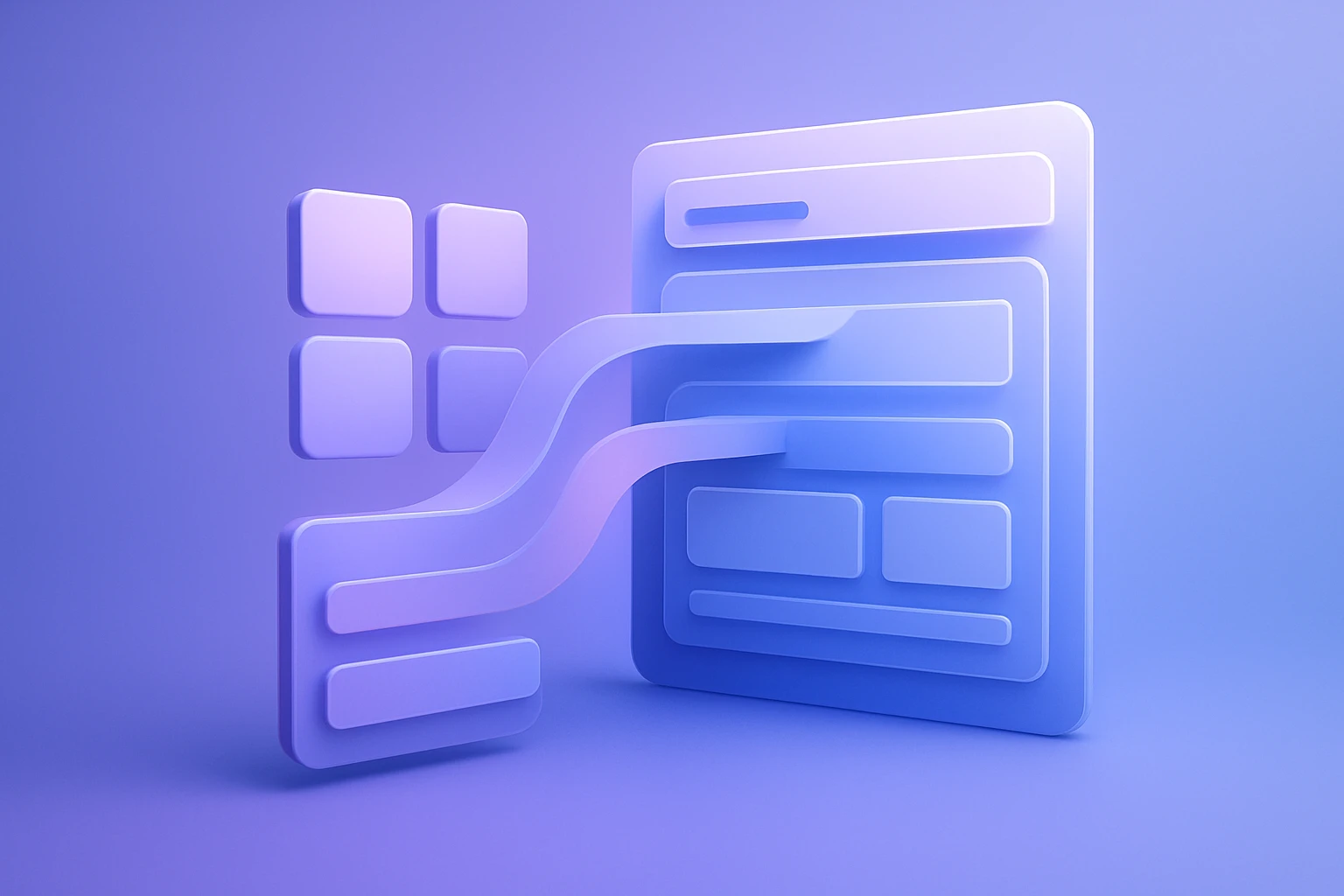
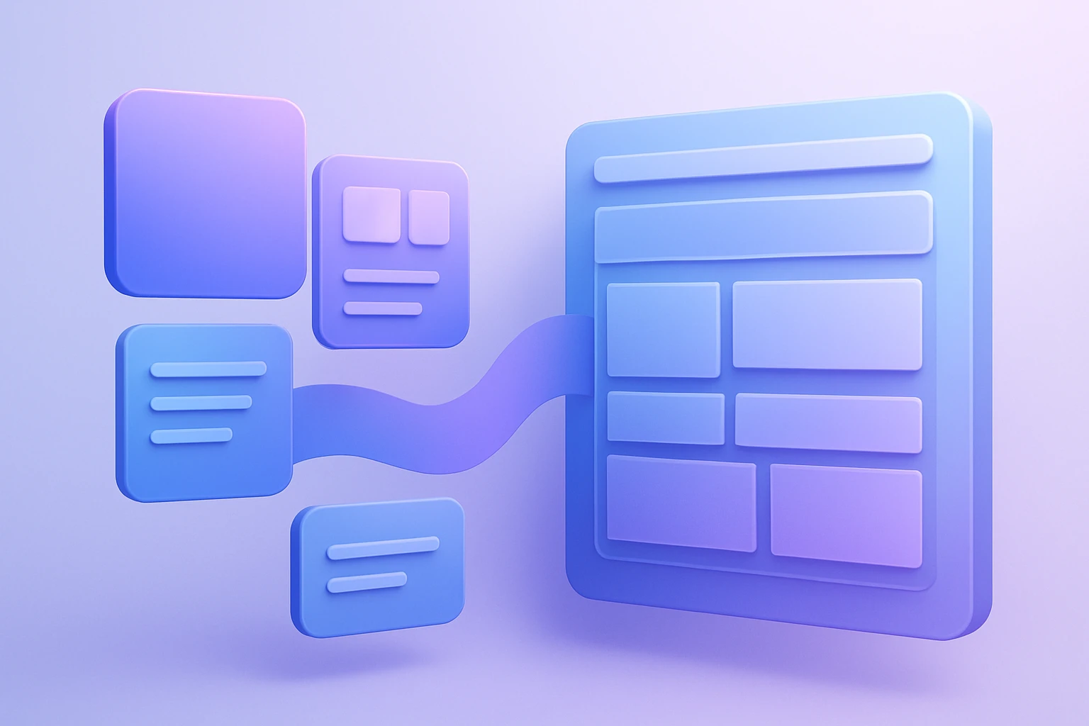
Figma to WordPress UI Consistency
Keeping ui consistency wordpress projects aligned with the original Figma mockup comes down to one core discipline: preserving spacing, typography, colors, and component behavior with precision from design to build. When the handoff is handled correctly, design accuracy is not just a visual goal—it becomes a repeatable workflow that protects the entire user experience.
For teams converting design files into WordPress, this matters because even small deviations in font size, line height, button padding, or mobile breakpoints can make a polished Figma interface feel “off” in production. Figma-to-WordPress workflows and plugins are built to reduce that drift, but they still require careful preparation, review, and testing to keep the final site faithful to the source design.
Why visual alignment matters in production builds
Users do not compare your live site against your design file consciously, but they absolutely notice when a page feels inconsistent, cramped, or unbalanced. In practice, interface consistency supports credibility, usability, and conversion because it helps visitors recognize patterns faster and navigate with less friction.
WordPress implementations can drift from Figma when developers rebuild layouts manually, when themes impose default styling, or when exported assets do not match the intended dimensions and behavior. Best-practice guides for translating Figma mockups into WordPress consistently emphasize careful asset preparation, responsive layout handling, and thorough testing to reduce these mismatches.
For a service-focused workflow like Figma2WP Service, the objective is not merely to “convert” a design. It is to recreate the visual system so the live WordPress experience stays close to the original structure, hierarchy, and responsiveness that the designer approved.
What usually breaks consistency during Figma to WordPress conversion
The most common issues are predictable, which is good news because they are preventable. The biggest sources of inconsistency are typography differences, spacing mismatches, incorrect component states, missing responsive rules, and poorly optimized assets.
- Typography drift: A font family may not be available in WordPress, or the theme may substitute a similar but not identical typeface.
- Spacing differences: Margins, padding, and gap values can shift when Figma measurements are not translated precisely into CSS.
- Component inconsistency: Buttons, cards, forms, and navigation elements may be rebuilt with slightly different styles across templates.
- Responsive mismatch: A layout that looks correct on desktop may collapse awkwardly on tablet or mobile if breakpoints are not planned carefully.
- Asset quality issues: Images, icons, and illustrations may lose sharpness or load inefficiently if export formats are chosen poorly.
Tools such as Figma, WordPress, Elementor, Bricks Builder, and Divi are often part of these workflows, and the quality of the result depends on how carefully the design system is carried across platforms.
Build the design system before exporting anything
The cleanest way to protect design accuracy is to make the Figma file easy to translate. Figma best practices repeatedly recommend clearly named layers, reusable components, organized styles, and export-ready assets so the WordPress implementation is easier to reproduce.
Prepare tokens and styles first
Before export, standardize typography, spacing, and color usage in Figma. Use consistent text styles for headings, body text, captions, and buttons, and define a simple color system with primary, secondary, neutral, and semantic tones. This makes it easier to mirror the interface in WordPress using global styles, theme settings, or builder-wide design controls.
Use reusable components everywhere
Buttons, cards, hero sections, testimonial blocks, navigation items, and form elements should be built as reusable Figma components. This reduces variation in the final site because the WordPress developer can map one component pattern to one code pattern instead of recreating the same element repeatedly by hand.
That is one reason many teams prefer workflows that pair Figma with tools such as FigWP or UiChemy, which emphasize style retention and responsive output during conversion.
How to preserve typography exactly
Typography is usually the first thing users notice when a website looks slightly different from the mockup. Even if every color and image is correct, a font size or line-height mismatch can make a page look less premium and reduce the sense of design accuracy.
Practical guides and tutorials on Figma-to-WordPress workflows repeatedly recommend checking font availability, setting global typography rules, and matching heading scales carefully so the WordPress theme reproduces the intended hierarchy.
- Verify font availability in the WordPress environment before development begins.
- Match font weights exactly, especially for bold and semi-bold headings.
- Replicate line-height and letter-spacing instead of relying on theme defaults.
- Define a global type scale so H1, H2, H3, body, and caption styles remain consistent across templates.
- Test text wrapping at different viewport widths to ensure the hierarchy still feels intentional on mobile.
A useful reference point for typography system planning is the native design approach described by WordPress Developer Resources and the design system guidance published by Figma Community, both of which reinforce the value of reusable, standardized styles.
Keep spacing and layout rhythm consistent
Spacing is where many conversions lose polish. In Figma, an interface can look perfectly balanced because the layout is locked to exact measurements. In WordPress, default margins, section wrappers, builder containers, and theme CSS can introduce subtle shifts unless they are explicitly controlled.
To keep the rhythm intact, establish a spacing scale and apply it consistently across sections, components, and responsive breakpoints. If a hero section uses 80px top padding in Figma, the WordPress implementation should reflect that intention in code or builder settings rather than approximating it.
- Use a fixed spacing scale such as 4, 8, 12, 16, 24, 32, 48, and 64.
- Match container widths so content does not appear stretched or compressed.
- Control vertical rhythm between headings, text, images, and buttons.
- Audit section padding on desktop, tablet, and mobile individually.
This is especially important for agencies serving USA, UK, and Canada markets, where users often expect clean, modern, and highly polished interfaces across industries such as SaaS, professional services, eCommerce, and local businesses.
Asset handling: the hidden layer of quality control
Exporting assets correctly is one of the simplest ways to improve the final result. Guides on Figma-to-WordPress workflows recommend preparing images, SVG icons, and graphics carefully so they preserve clarity and integrate smoothly into the WordPress site.
SVG is usually best for icons and simple vector graphics because it remains crisp at any resolution. PNG and JPEG are more suitable for complex raster images, though they should be optimized to avoid bloating page weight. The right export format helps preserve visual fidelity while supporting performance.
For performance and consistency, many teams also use tools like etchd, TinyPNG, and Squoosh to compress assets without introducing visible degradation. That combination supports faster loading while keeping the original artwork intact.
Responsive behavior is part of design accuracy
Design accuracy is not complete if the site only looks correct on one screen size. Modern WordPress builds must preserve the same visual logic across desktops, tablets, and phones, and best-practice articles for Figma-to-WordPress conversion consistently stress mobile-first thinking and device testing.
Responsive accuracy means more than making things “fit.” It means maintaining hierarchy, spacing, tap targets, and readability as the viewport changes. A proper conversion keeps the same visual intent even when the layout rearranges.
What to test on each breakpoint
- Typography scaling to ensure headings remain prominent and body text stays readable.
- Button size and spacing so interactive elements remain accessible.
- Navigation behavior so menus collapse or expand in a usable way.
- Grid and card stacking so sections do not feel crowded.
- Image cropping so focal points remain visible.
Tools like BrowserStack and Lighthouse are useful for checking responsiveness and frontend quality across devices and performance conditions.
Where plugins help, and where human review still matters
Plugins can accelerate the translation from Figma to WordPress, especially when they preserve styles, dimensions, and content mapping. The FigWP plugin description highlights style consistency, including colors, fonts, spacing, and overall design integrity, while UiChemy emphasizes responsive, customizable WordPress output and global style syncing.
At the same time, no tool fully replaces human review. Automated conversion may preserve structure, but a developer or designer still needs to verify whether the live page matches the source file in practical use. The final check should always include spacing, font rendering, image scaling, interaction states, and browser behavior.
For teams comparing implementation routes, the choice often comes down to speed versus control. WordPress page builders such as Elementor, Divi, and Advanced Custom Fields can support flexible layouts, but the best results come when the design system is planned for the platform from the beginning.
Real-world workflow example: landing page conversion
Consider a B2B SaaS landing page built in Figma with a hero section, feature cards, testimonial carousel, pricing area, and FAQ block. The mockup looks polished because spacing, typography, and CTA hierarchy are tightly controlled. A WordPress build can match that quality if the implementation follows a structured process.
First, the design team prepares the Figma file using consistent components and named styles. Then the developer recreates the layout in WordPress using either a theme builder or custom templates. Assets are exported in the correct formats, typography is configured globally, and each section is checked at multiple breakpoints.
In practice, the best teams also validate content behavior. For example, if a testimonial card contains longer text than the design sample, the WordPress version must still retain visual balance. This is where real design accuracy matters: the implementation should support realistic content, not only the idealized mockup.
Real-world workflow example: eCommerce product page
An eCommerce product page introduces additional consistency challenges because product titles, descriptions, pricing badges, and promotional labels often vary in length. If the Figma design does not account for those variations, the WordPress build may appear unstable once real products are added.
To avoid that, the design should define flexible card sizes, consistent image ratios, reusable callout styles, and clear rules for text overflow. WordPress implementations built with WooCommerce benefit from these guidelines because product data can change dynamically while the interface remains visually disciplined.
This is one of the strongest arguments for prioritizing UI consistency in WordPress: a good system does not just mirror the design file, it also handles real content gracefully without breaking the visual language.
Agency process: how to protect consistency from brief to launch
High-quality Figma-to-WordPress delivery usually depends on a shared workflow between designers, developers, and project managers. The strongest implementations reduce ambiguity early, document component rules clearly, and review live pages against the source design before launch.
- Audit the Figma file for component reuse, naming, and style consistency.
- Lock typography and spacing rules before build starts.
- Choose the implementation method, whether a custom theme, builder, or conversion plugin.
- Map content structure so headings, cards, forms, and media blocks behave predictably.
- Test responsive states across real devices and browsers.
- Review the site against the design file section by section.
- Refine the edge cases before the final launch.
This process aligns well with a managed service like Contact Us, especially when the objective is to deliver a polished WordPress site that respects the original design language without unnecessary rework.
Practical quality checklist for ui consistency wordpress projects
A strong quality checklist helps teams catch issues early. If a site feels visually “different” after implementation, one or more of these areas is usually responsible.
- Typography: font family, weight, size, line-height, and letter-spacing all match the design.
- Spacing: padding, margins, and section gaps are consistent across all page types.
- Color fidelity: brand colors and interactive states match the approved palette.
- Image handling: assets are sharp, cropped correctly, and optimized for performance.
- Responsive layout: each breakpoint preserves hierarchy and usability.
- Component reuse: buttons, cards, forms, and navigation follow the same rules everywhere.
- Content flexibility: longer text, dynamic data, and extra content do not break the layout.
If you want to compare platform patterns or implementation guidance, resources from WPBeginner, Make WordPress, and web.dev can help you think through performance, structure, and frontend quality as part of the build process.
Why consistency affects trust, not just aesthetics
When a website preserves the original design accurately, visitors experience fewer visual surprises. That creates a sense of continuity across pages, which supports brand trust and makes the site feel professionally maintained. In that sense, design fidelity is a business issue as much as a visual one.
For agencies, founders, and in-house teams, this is especially important because the WordPress site often becomes the public-facing version of the brand system. If the live build loses consistency, the brand can appear less deliberate even if the underlying product or service is strong.
How Figma2WP fits into a consistency-first workflow
A specialized conversion partner can reduce the risk of style drift by focusing on the exact points where WordPress implementations usually diverge from Figma. That includes spacing logic, typography matching, reusable component structure, and responsive behavior across all major devices.
Figma2WP Service is positioned to support this kind of workflow by treating the design file as the source of truth and translating it into a WordPress experience that preserves the visual system rather than approximating it. If your project depends on reliable UI consistency wordpress delivery and strong design accuracy, that approach is typically the safest path.
If you are planning a new build, redesign, or migration, you can start with Figma2WP Service or reach out through Contact Us to discuss the scope, implementation method, and fidelity expectations.
For teams serving the USA, UK, and Canada, the strongest results usually come from a clear design system, careful handoff, and implementation discipline. When those three elements line up, Figma-to-WordPress conversion can produce a site that feels almost indistinguishable from the original concept while remaining flexible enough for real-world content and future growth.

More From Our Blog
Mastering the Translation: Bridging Figma Components to WordPress Blocks The core challenge of converting a design from Figma to WordPress lies not in the tools, but in the logical mapping of figma components to WordPress blocks. This process, often called design mapping, requires a designer or developer to interpret the visual hierarchy created in Figma Read more…
Transforming Visual Design into Scalable Code with Design Tokens The handoff from designer to developer has historically been one of the most painful bottlenecks in web projects, often resulting in inconsistent colors, mismatched typography, and hours of manual refront. However, the integration of design tokens into a WordPress workflow using Figma tokens has revolutionized this Read more…