
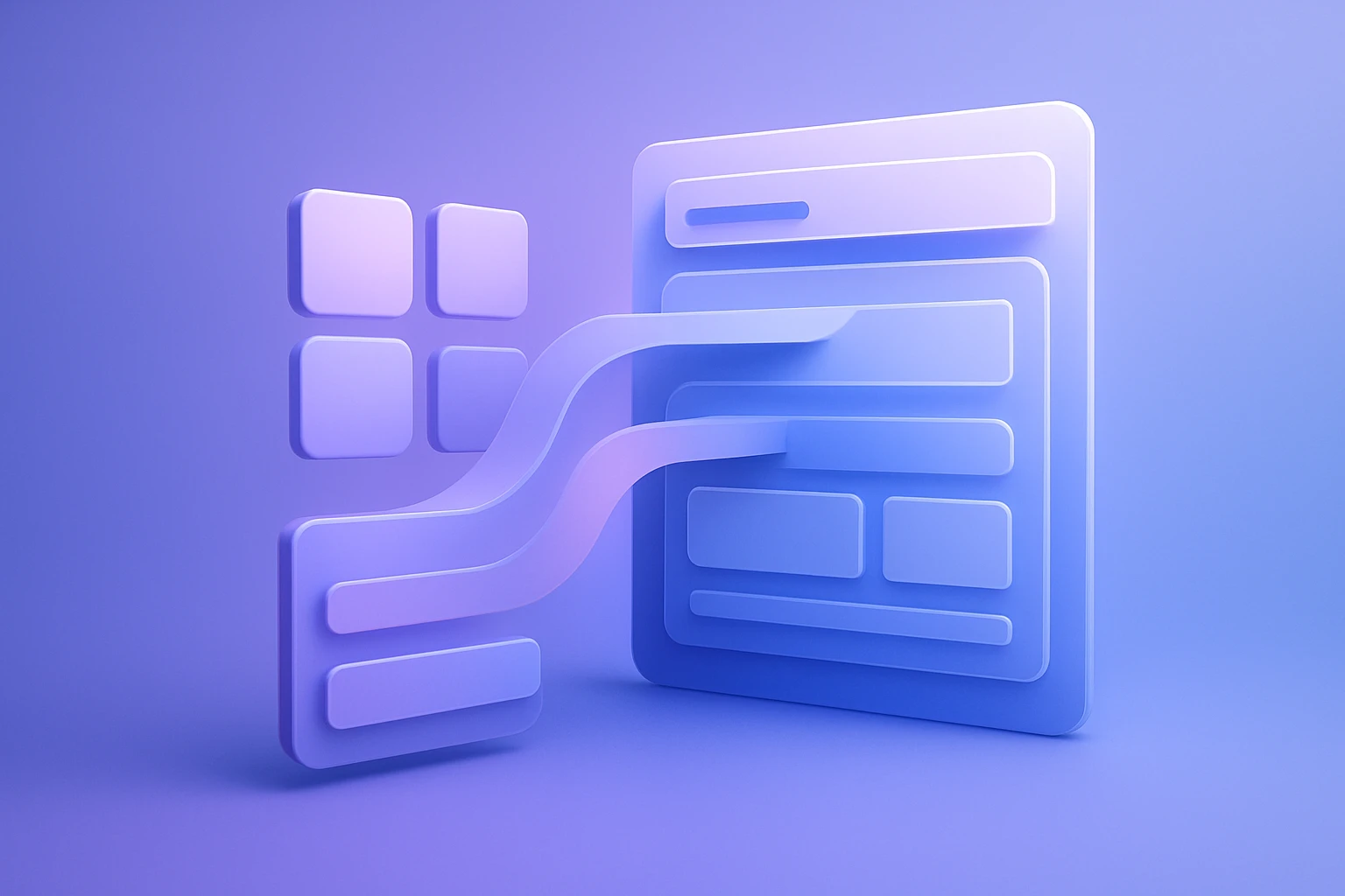
Figma to WordPress Mobile First Approach
If you are planning a Figma to WordPress mobile first approach, the smartest workflow is to design for the smallest screen first, then expand the experience for tablet and desktop. That method keeps the core journey clear, improves usability on phones, and makes the eventual WordPress build easier to maintain across devices, which is exactly why mobile first wordpress workflows and figma mobile design practices are becoming standard for modern web projects.
At Figma2WP Service, the goal is to turn a polished Figma concept into a WordPress website that behaves well on real screens, not just in a desktop mockup. If you want to start a project or discuss a redesign, you can also use the Contact Us page.
Why mobile-first planning changes the quality of the final website
Mobile-first design starts with the user constraints that matter most: limited screen space, touch interaction, slower networks, and fast decision-making. Figma’s own mobile-first guidance emphasizes focusing on what users need most on small screens, then building upward from there. In practice, that means your WordPress site is less likely to be bloated, confusing, or hard to scan on a phone.
This approach is especially useful for service businesses, SaaS companies, eCommerce brands, and local businesses in the USA, UK, and Canada, where mobile traffic often represents a major share of visits. If the mobile version works well, the desktop version usually becomes a refinement rather than a rescue operation.
- Better hierarchy: mobile-first forces you to decide what matters most.
- Cleaner UX: fewer unnecessary elements improve clarity and reduce friction.
- Stronger performance: mobile-first builds often encourage lighter layouts and fewer assets.
- Faster WordPress implementation: a well-structured Figma file makes handoff smoother.
How to organize a Figma mobile design workflow before WordPress development
Good mobile-first work in Figma is not just about shrinking a desktop layout. It begins with a clear content strategy, then a set of components, spacing rules, and responsive behaviors that can survive implementation in WordPress. Figma’s Auto Layout, Constraints, and reusable components are repeatedly highlighted as key tools for building flexible, adaptive interfaces.
Start with the smallest practical frame
Designing from a small mobile frame, such as a 320px-wide viewport, helps you identify what should be visible first and what should be delayed or removed. This is where many teams discover that their “must-have” content is actually optional.
For example, a homepage hero for a consulting firm may need only one headline, one supporting sentence, one primary button, and a trust signal on mobile. Desktop can later expand that section with supporting logos, stats, or secondary messaging.
Use Auto Layout to protect structure
Auto Layout in Figma helps stacked content, buttons, cards, and form fields behave more predictably as frames change size. It is one of the most practical ways to design for WordPress responsiveness because it encourages you to think in terms of flow rather than fixed pixels.
That matters when the design is later translated into Gutenberg blocks, a custom theme, or a hybrid build. A section that is logically spaced and grouped in Figma is easier to reproduce in WordPress without relying on fragile one-off CSS overrides.
Apply Constraints so the design scales correctly
Constraints define how elements resize or reposition when the frame changes. In a mobile-first workflow, they help maintain alignment for logos, nav triggers, images, and call-to-action buttons as layouts transition from phone to tablet to desktop.
This is particularly important for headers, sticky bars, promotional banners, and content cards. If the constraints are wrong in Figma, the WordPress implementation usually inherits the same problems.
Build reusable components before you expand the page set
Reusable components save time and keep the site visually consistent. Figma recommends components for buttons, menus, and other repeated UI pieces, while collaboration and quick feedback loops help teams refine them early.
For a WordPress project, this often maps naturally to:
- button styles
- hero sections
- testimonial cards
- pricing tables
- FAQ rows
- blog post previews
A practical Figma to WordPress process that works for responsive websites
A reliable workflow is to treat Figma as the source of truth for layout logic, then use WordPress as the system that turns that logic into a maintainable live site. Several sources describing Figma-to-WordPress workflows recommend starting with mobile-first planning, exporting or importing design assets, then testing on multiple devices after implementation.
- Define the mobile content hierarchy and user goals.
- Create the core mobile screens in Figma using Auto Layout and components.
- Extend the system to tablet and desktop using the same structure.
- Prepare assets, spacing rules, and typography styles for handoff.
- Build the WordPress version with responsive blocks, a custom theme, or a plugin-based workflow.
- Test the result on real devices and refine spacing, tap targets, and image behavior.
What should be finalized in Figma before development starts
Before WordPress development begins, the Figma file should clearly define the most important layout and UI decisions. The more ambiguity you remove, the less guesswork is needed during build-out.
- mobile navigation behavior
- spacing scale
- typography hierarchy
- button styles and states
- image proportions
- section order for mobile
- responsive behavior for cards and lists
Figma’s resource library on mobile-first design highlights readable fonts, thoughtful spacing, familiar navigation patterns, and larger touch targets as important mobile UX practices. Those choices directly affect how well the final WordPress site performs for real users.
What a strong mobile-first WordPress build should include
A WordPress site built from a mobile-first Figma design should feel intentional, lightweight, and easy to use. The build phase is where design decisions are translated into a maintainable system, whether through a custom theme, block theme, or a visual builder.
If the project includes advanced layouts or highly branded sections, teams often use Figma to define the visual structure and then recreate that structure in WordPress using responsive blocks or theme components. The official Figma to WordPress plugin also exists as a concept and tool within Figma’s ecosystem, reinforcing that this design-to-site workflow is an established use case.
Must-have implementation details
- Responsive typography: text should remain readable without zooming.
- Tap-friendly buttons: interactive elements need enough space for fingers.
- Optimized images: images should scale cleanly and load efficiently.
- Fluid containers: cards and sections should adapt without breaking alignment.
- Accessible spacing: white space should preserve clarity on small displays.
- Consistent components: recurring UI should behave the same across templates.
In many WordPress projects, the biggest mobile issue is not the desktop design itself but how it was translated into the theme. If the original Figma mobile design was treated as a first-class layout, the implementation stage becomes much cleaner.
Common mistakes teams make when turning Figma into mobile first wordpress pages
Many redesign projects fail because the team treats mobile as a compressed version of desktop rather than the foundation of the experience. That mistake creates overcrowded layouts, weak hierarchy, and inconsistent spacing when the site is finally published.
Designing desktop first and shrinking later
This is the classic error mobile-first design is meant to solve. Figma’s mobile-first guidance explicitly recommends starting with small screens and building upward, not the other way around.
Ignoring real touch behavior
Mobile users do not click; they tap. Buttons that look attractive on desktop can become difficult to use on phones if they are too small or too close together. Figma’s mobile-first principles emphasize larger touch targets and spacing that supports easy interaction.
Overloading mobile pages with content
Mobile space is limited, so content prioritization matters. If a page contains too many competing messages, the user experience becomes noisy and the conversion path becomes unclear.
Skipping real-device testing
Several workflow guides recommend testing Figma prototypes and WordPress builds on actual devices, not just in preview mode. That is important because a layout that appears fine on a desktop monitor can break on a smaller phone, especially if line heights, image ratios, or sticky elements were not carefully checked.
Real-world examples of mobile-first thinking in a Figma to WordPress project
Consider a law firm website serving clients across the UK and Canada. On desktop, the homepage can include a full hero banner, a practice-area grid, client logos, a long-form introduction, and multiple trust sections. On mobile, the same page should likely begin with a concise value proposition, one primary booking button, a short list of services, and a simple trust indicator.
That is the kind of prioritization mobile-first design encourages in Figma. When the WordPress build follows the same order, the result is usually faster, cleaner, and easier to convert.
A second example is an eCommerce brand selling lifestyle products in the USA. The desktop storefront may feature promotional banners, filters, editorial content, and product collections. On mobile, the emphasis should shift toward fast browsing, intuitive filtering, compressed imagery, and a strong add-to-cart experience. If the Figma mobile design already reflects that hierarchy, WordPress development can focus on execution instead of restructuring.
A third example is a SaaS landing page. Mobile users may arrive from paid ads, LinkedIn, or organic search and need one immediate action: start a trial, book a demo, or explore pricing. A mobile-first Figma workflow can reduce the homepage to the shortest path to that action, while desktop can support deeper storytelling, screenshots, and comparison tables.
Helpful tools and resources that support the workflow
Several tools are relevant when planning or implementing a mobile-first Figma-to-WordPress project. These resources can help teams design, prototype, test, and translate layouts more efficiently.
- Figma for collaborative interface design and prototyping.
- Figma Mobile-First Design Guide for principles, examples, and strategies.
- Figma to WordPress Plugin for Figma-to-WordPress conversion workflows.
- html.to.design for importing WordPress pages into Figma during redesign work.
- WordPress as the content management system and publishing platform.
- WordPress Block Editor for building responsive content with blocks.
- Bootstrap for teams that use responsive front-end patterns in custom builds.
- PageSpeed Insights for checking performance and mobile usability.
- web.dev for web performance and responsive design best practices.
- Smush for image optimization in WordPress workflows.
How agencies and in-house teams can collaborate more effectively
One of Figma’s biggest advantages is real-time collaboration. The platform is designed to help teams work together faster, gather feedback, and build shared understanding before implementation starts. That makes it especially useful for agency-client workflows where marketing, design, and development all need to agree on the mobile experience early.
A practical collaboration model looks like this: strategy defines the content hierarchy, design creates the mobile screens in Figma, development translates those screens into WordPress, and QA checks the result across devices. When those roles are aligned, fewer revisions are needed and the launch process becomes more predictable.
For businesses that want a dedicated design-to-WordPress partner, this is where a specialized service such as Figma2WP Service can be valuable, because the handoff is not just about visual fidelity but about responsive behavior, speed, and maintainability.
SEO and conversion benefits of a mobile-first WordPress build
Mobile-first design is not only a UX decision; it also affects SEO and conversion performance. Search engines and users both reward pages that are easy to read, fast to load, and simple to navigate on phones. Figma’s mobile-first resources specifically connect content prioritization, load speed, and user needs on the go.
When a WordPress site is built from a mobile-first Figma file, the likely benefits include:
- better readability on small screens
- lower bounce risk from cluttered layouts
- clearer CTA placement
- faster perceived performance
- more consistent conversion paths across devices
This is especially important for lead-generation websites, where one poorly spaced mobile section can reduce form fills or calls. It is also important for content-driven brands, where mobile navigation and scanability determine whether users stay or leave.
What a strong final handoff should look like
A clean Figma-to-WordPress handoff should include more than visuals. It should communicate the rules behind the visuals so developers can reproduce them accurately in WordPress.
- Figma frames for mobile, tablet, and desktop
- component library and styles
- spacing and typography guidelines
- image and icon export rules
- interaction notes for menus, accordions, and forms
- content priorities for each page type
The more clearly the Figma mobile design defines behavior, the easier it is to build a dependable mobile first wordpress site without unnecessary rework.
Why this approach works particularly well for USA, UK, and Canada audiences
For audiences in the USA, UK, and Canada, mobile browsing is often tied to fast decision-making: booking services, comparing providers, reading reviews, or contacting a company from a search result. That makes concise layouts, fast load times, and clear navigation especially valuable.
A mobile-first WordPress website built from a strong Figma system can support those behaviors better than a desktop-centric design adapted late in the process. The result is usually a better user experience, cleaner internal workflows, and a website that is easier to scale.
If you are planning a redesign, launching a new brand site, or converting a static concept into a responsive WordPress build, the safest path is to start with the mobile experience, validate it in Figma, and then build upward with precision. If you would like help turning that process into a real project, visit Contact Us and share your goals.

More From Our Blog
Mastering the Translation: Bridging Figma Components to WordPress Blocks The core challenge of converting a design from Figma to WordPress lies not in the tools, but in the logical mapping of figma components to WordPress blocks. This process, often called design mapping, requires a designer or developer to interpret the visual hierarchy created in Figma Read more…
Transforming Visual Design into Scalable Code with Design Tokens The handoff from designer to developer has historically been one of the most painful bottlenecks in web projects, often resulting in inconsistent colors, mismatched typography, and hours of manual refront. However, the integration of design tokens into a WordPress workflow using Figma tokens has revolutionized this Read more…