
Figma to WordPress Dark Mode Implementation
Dark mode implementation is one of the most valuable upgrades you can carry from Figma into WordPress when you want a modern, polished user experience. Done well, it improves readability, strengthens brand perception, and gives users a choice that feels native across devices and platforms.
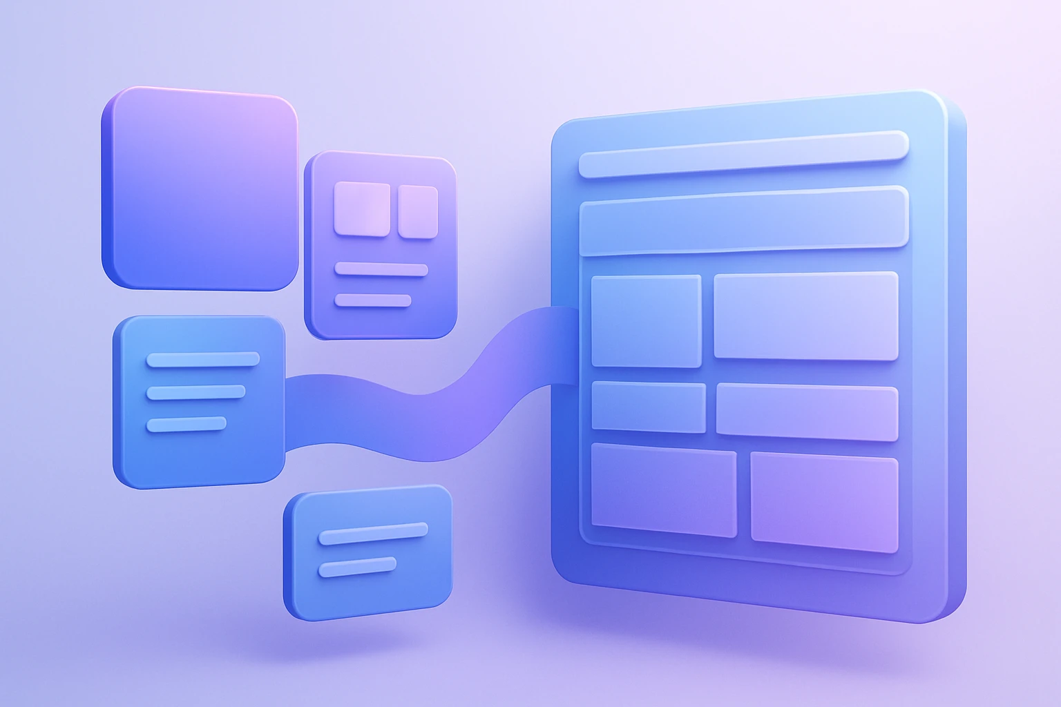
When designers hand off a figma dark theme to development, the biggest risk is inconsistency: colors that looked perfect in Figma can become too muddy, too low-contrast, or too dependent on fixed values once they land in WordPress. That is why a structured workflow matters, especially if you are building or converting a site through Figma2WP Service.
Designing a Theme System That Actually Survives the Handoff
A reliable dark mode starts before development begins. In Figma, the goal is not just to “invert” colors, but to build a reusable system of tokens, styles, and states that can map cleanly into WordPress theme settings or theme.json values. Guidance from Figma-to-WordPress workflows emphasizes setting up separate light and dark color styles, testing contrast in Figma, and preparing adaptable palettes before implementation begins.
Why Figma variables matter
Using variables or color styles in Figma makes it easier to maintain parallel light and dark palettes without manual guesswork. That approach also aligns with tools that export Figma variables into WordPress’s theme.json structure, which can carry colors, typography, spacing, and mode-based variations into a WordPress theme.
If your design system includes semantic tokens such as background, surface, text-primary, and border-subtle, the WordPress implementation becomes far more manageable than if you rely on raw hex colors. This is especially important for brands serving the USA, UK, and Canada markets, where accessibility expectations and device preferences are high across professional, ecommerce, and SaaS audiences.
Accessibility should be built into the design file
Dark interfaces are not automatically accessible. Figma’s accessibility checks are recommended to verify text contrast and element visibility against dark backgrounds before handoff. That matters because low-contrast grays can look elegant in a design mockup and unreadable in real-world use, especially on lower-quality mobile displays.
A practical rule: test every text style, button state, and muted label in both themes. If a component depends on thin font weights or pale accent colors, it should be reviewed against WCAG contrast expectations before it ever reaches WordPress.
Choosing the Right WordPress Path for Dark Mode
There is no single best implementation strategy. The right choice depends on whether your WordPress site is being built from a custom theme, a block theme, or an existing commercial theme. A solid handoff process should decide early whether dark mode will be handled by a plugin, a theme setting, or custom code.
Option 1: Use a dark mode plugin
For many sites, the fastest path is a plugin. The Figma2WP guidance recommends installing a plugin such as WP Dark Mode, then enabling frontend dark mode and OS-aware behavior so the site can match user preferences automatically.
This approach works well when you want a quick launch, minimal engineering overhead, and a straightforward toggle for visitors. It is especially useful for content sites, blogs, and smaller marketing websites that need a dark mode without a deep theme rewrite.
Option 2: Use a theme with built-in dark mode support
Some modern WordPress themes already include dark mode toggles or appearance settings. According to the Figma-to-WordPress guidance, if your theme advertises dark mode support, you can often enable it in the theme settings panel under appearance or customization options.
For teams choosing this path, it is worth evaluating themes from established ecosystems such as WordPress themes directory, Elementor, or Astra, depending on the build approach and design flexibility you need. These brands are commonly used in production workflows because they offer broad customization and large user bases.
Option 3: Build custom CSS and JavaScript
If design fidelity is critical, custom code gives the highest level of control. The Figma2WP guide describes adding custom CSS in WordPress via Appearance > Customize > Additional CSS, along with JavaScript for a user-controlled light/dark toggle.
This is often the preferred route for brands with strict visual identity rules, advanced component libraries, or complicated color behavior. It also allows a development team to match the figma dark theme more precisely than a generic plugin can.
How to Translate Figma Dark Theme Decisions Into WordPress
The core challenge is not making a site dark; it is making it feel designed in dark mode. That means each element must be evaluated by function, not just color.
Build semantic color mapping, not literal color copying
Instead of exporting “blue 500” or “gray 900” and using those everywhere, map your design around semantic roles: page background, card background, text emphasis, icons, dividers, focus states, and brand highlights. Export tools such as the 10up Figma-to-WordPress theme.json exporter and other Figma-to-WordPress automation workflows are designed around translating variables and design tokens into WordPress structures.
This reduces rework when the branding team asks for tweaks. If the “surface” token changes, the entire UI updates consistently in both modes instead of forcing developers to hunt down hardcoded colors.
Define component behavior in both themes
Dark mode is often broken by component-level assumptions. A card that looks clean in light mode may need a slightly brighter border in dark mode; a CTA button may need a more saturated hover state; form fields may need stronger outline contrast. These kinds of adjustments are exactly where design systems help, because they define component states before development begins.
If you are converting from Figma into a WordPress build, every reusable component should include:
- Default state for light mode
- Dark mode state for backgrounds, borders, and text
- Hover and focus states for accessibility
- Disabled and error states for form elements
- Image and icon treatment if assets need alternate versions
Implementation Patterns That Work Best in Production
There are three dominant implementation patterns in real projects, and each has a different tradeoff between speed, control, and maintainability.
- Plugin-first implementation for rapid deployment and simple user toggles.
- Theme-level implementation for block themes and modern WordPress architectures.
- Custom-code implementation for exact brand matching and advanced token systems.
Plugin-first: fast and practical
The biggest advantage of plugin-first dark mode is speed. The Figma2WP guide notes that WordPress users can install, activate, and configure dark mode settings quickly, including OS-aware switching. For small businesses and content publishers, this can be enough to ship a credible dark experience without rebuilding the site.
If you use a plugin, test it against your brand palette carefully. Plugin defaults often rely on generic inversion logic or simplified palettes, which may not match a carefully crafted figma dark theme.
Theme-level: best for modern block-based workflows
Theme-level support is increasingly attractive because WordPress block themes and global styles make it easier to centralize design tokens. The broader workflow described by Figma-to-WordPress automation tools shows how variables can be translated into theme.json so a theme’s global system can control colors and other styles consistently.
This approach is ideal when your organization expects regular redesigns, seasonal styling updates, or multiple brand variants. It also keeps dark mode aligned with the site’s native style controls rather than relying on an external widget layer.
Custom-code: best for precision
Custom CSS and JavaScript remain the best option when you need total control over spacing, shadows, overlays, and transition behavior. For example, you can create a toggle that stores preference in local storage, listens to OS color-scheme settings, and updates CSS variables without reloading the page.
That is especially useful for premium brands, SaaS dashboards, and conversion-focused landing pages where the smallest visual inconsistency can affect trust.
Real-World Use Cases That Show Why Dark Mode Matters
Dark mode is not a gimmick; it solves concrete user experience problems in the right context. The strongest use cases tend to be websites where users spend longer sessions, compare multiple pieces of content, or work in low-light conditions.
Case study: content-heavy publishing sites
A news or editorial website that runs long-form articles can benefit from dark mode because readers often browse at night and prefer reduced glare. A balanced wordpress dark mode implementation should preserve article readability, keep links legible, and maintain a visible hierarchy for headings and quotes.
In these sites, the most common mistake is using too much pure black. A softer charcoal background usually performs better because it reduces contrast fatigue while still providing a distinct dark environment. That design logic fits well with the best-practice advice to create adaptable palettes rather than a simple inverted scheme.
Case study: SaaS and product websites
SaaS brands often want dark mode because users associate it with modern software interfaces. When a Figma design system is carefully exported into WordPress, the dark theme can preserve product screenshots, feature cards, pricing sections, and CTAs without visual drift. Tools that convert Figma variables into WordPress theme definitions are especially relevant here because SaaS pages typically depend on consistent UI components across dozens of templates.
For example, a pricing page can use the same semantic tokens for panel backgrounds and button styles across hero, comparison, and FAQ sections, making the site easier to update and scale.
Case study: ecommerce experiences
For ecommerce stores, dark mode is most effective when it does not interfere with product photography or trust signals. Brands like WooCommerce, WooCommerce plugin directory, and page builders such as Elementor are often used in builds where theme control and layout flexibility are essential.
Dark mode in ecommerce should be tested carefully for product cards, sale badges, star ratings, and image backgrounds. If the product itself is bright or reflective, a dark page background can make it stand out; if the image contains dark products, the interface may need brighter framing and borders.
What to Test Before You Ship
Dark mode failures usually happen during QA, not design. The best teams build a test plan that checks content, components, and behavior across devices and browsers.
Priority checks for QA
- Text contrast in paragraphs, buttons, labels, and navigation
- Focus visibility for keyboard users
- Form errors and success messages in both themes
- Images and logos that may need alternate asset versions
- Shadow and elevation effects that can disappear in dark mode
- OS-aware switching so user preferences behave as expected
These checks align with Figma-to-WordPress recommendations to enable OS-aware dark mode and to test contrast during design and implementation.
Cross-device considerations
Dark mode can look different on iPhone, Android, Windows laptops, and Mac displays because of screen calibration and ambient light. A wordpress dark mode implementation should therefore be checked on real devices, not just in a browser emulator. If your audience includes office workers, commuters, or late-night readers, this testing becomes even more important.
Tools and Resources Commonly Used in a Dark Mode Workflow
A serious implementation pipeline often combines design tools, automation, and WordPress-specific controls. The best stack depends on your team size and the complexity of the site.
On the design side, teams often rely on Figma for interface design, variable management, and component system preparation. On the WordPress side, WordPress remains the foundation, while plugins and exporters help bridge the gap between design and implementation.
Automation and token-export tools can reduce manual translation work. For example, 10up’s exporter focuses on moving Figma variables into WordPress theme definitions, while Figma-to-WordPress plugin workflows aim to convert designs into functional themes more directly.
For teams that want a managed conversion workflow, a specialized service such as Figma2WP Service can help streamline the transition from design to WordPress build, especially when the project needs a custom visual system rather than a generic site template.
Practical Recommendations for a Better Figma to WordPress Dark Mode Build
If you are planning a conversion project, these practices will save time and reduce rework.
- Design light and dark themes together so component behavior is consistent.
- Use semantic tokens instead of hardcoded colors.
- Test contrast early in Figma before the build begins.
- Decide the implementation method early so the handoff matches the final tech stack.
- Use WordPress theme settings when the theme already supports dark mode.
- Use custom CSS/JS when precision matters more than speed.
- Document component states for buttons, forms, cards, and alerts.
- Check browser and OS preferences so user-controlled mode switching behaves correctly.
How Agencies and Product Teams Can Structure the Project
For agencies, the cleanest workflow usually starts with a design audit, then a token map, then implementation, then QA. That structure keeps designers, developers, and stakeholders aligned on what “dark mode” actually means for the brand.
For product teams, the same workflow can be layered into existing design system governance. If your team uses Confluence for documentation or Notion for specs, it helps to document the dark palette, rules for contrast, and component overrides in one place. That documentation becomes the source of truth when a new landing page or template is built later.
If you need hands-on support converting a Figma design into a WordPress experience that includes dark mode logic, you can explore the build process through Contact Us and align the implementation with your theme and brand system from the start.
Why This Matters for SEO, Engagement, and Brand Perception
Dark mode is not only a visual feature. It can influence engagement by making a site feel more modern, more comfortable for extended reading, and more aligned with user preferences. That matters because visitors often judge quality within seconds, and a cohesive light/dark experience can improve perceived polish.
From an SEO perspective, dark mode does not directly rank a site higher, but it can support a better user experience, which may contribute to longer visits and stronger brand recall. A carefully implemented figma dark theme inside WordPress helps ensure the site feels intentional rather than patched together.
If you are comparing frameworks, themes, and conversion strategies, it is worth reviewing the current WordPress ecosystem through WordPress themes, major builders like Elementor, and documentation resources from WordPress.org before finalizing your stack.
For teams that need a conversion partner rather than a generic plugin workflow, Figma2WP Service is positioned around turning design intent into a working WordPress build, and the Contact Us page is the right place to start if you want to discuss a project with custom dark mode requirements.
Summary in practice: build dark mode as a system in Figma, map it to semantic tokens, choose the right WordPress implementation path, and test aggressively before launch. That approach gives you a dark interface that feels designed, accessible, and dependable instead of merely inverted.
If your team is planning a redesign, migration, or Figma-to-WordPress conversion with dark mode built in from day one, the safest next move is to define the design system first, then translate it into WordPress with a workflow that matches your budget, timeline, and brand goals.

More From Our Blog

Mastering the Translation: Bridging Figma Components to WordPress Blocks The core challenge of converting a design from Figma to WordPress lies not in the tools, but in the logical mapping of figma components to WordPress blocks. This process, often called design mapping, requires a designer or developer to interpret the visual hierarchy created in Figma Read more…
Transforming Visual Design into Scalable Code with Design Tokens The handoff from designer to developer has historically been one of the most painful bottlenecks in web projects, often resulting in inconsistent colors, mismatched typography, and hours of manual refront. However, the integration of design tokens into a WordPress workflow using Figma tokens has revolutionized this Read more…